We love making art. That’s a fact. But another hidden fact is that most installations will have some form of text in them. Whether the text is artistic or not depends on the project! That aside, there are a lot of secret tricks that allow pros to use the Text TOP effectively in TouchDesigner to do complex layouts very quickly. There are also some tricks we use to get around doing complex math to figure text sizes and similar. In this post, I’ll show you a few of the best tricks for the Text TOP.
If you’re a beginner and need are not too familiar with this operator yet, check out our tutorial first:
Custom Layouts using Text TOP in TouchDesigner
This is probably the biggest trick that most beginners and intermediates don’t know about. We know that you can connect a table to a Text TOP and pull out the strings, but we can go much deeper. In this example I’m going to pretend to make a 3-day weather forecast layout, including day of the week, temperature, and a word about the condition. You’ve probably seen a network like this:
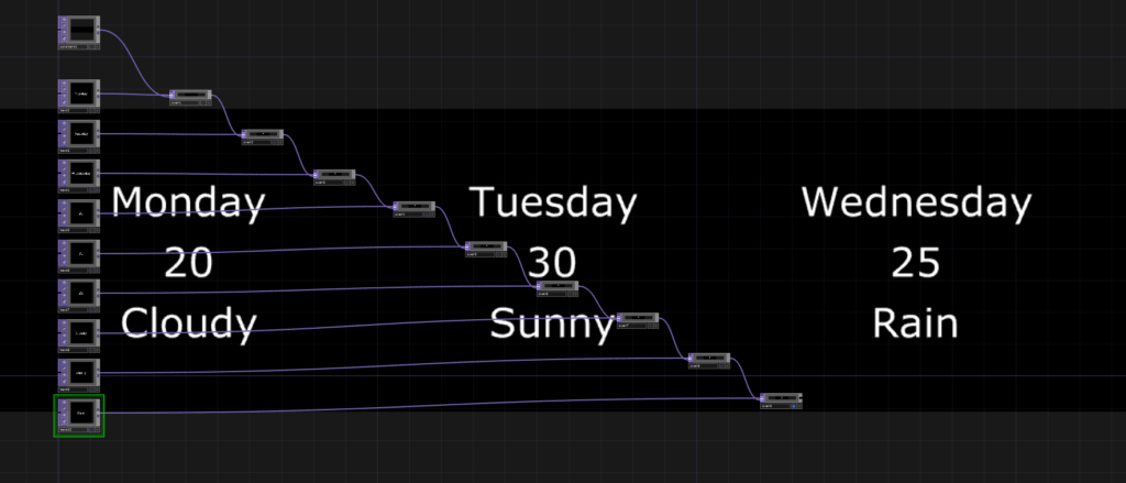
This is the way most new users do text layouts. Lots of Text TOPs and lots of Over TOPs or Composite TOPs. With something called a specifications DAT we can actually control the positions of individual elements of text in a table. The first thing we need is a Table DAT with the first column being our different elements of text. This table needs to have the first column labeled as text:
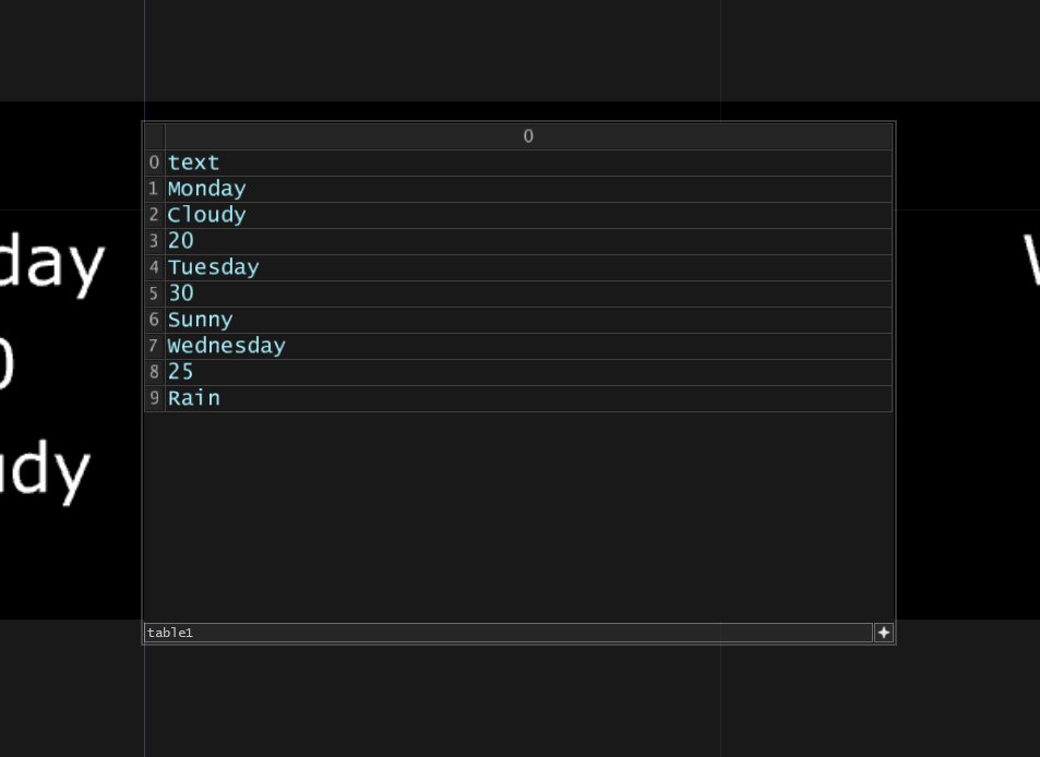
Now we can go to our Text TOP, delete the default text, and assign this table as our Specifications DAT:

When we do this, we’re going to see a warning flag on the Text TOP telling us there’s no x column. Here’s where the magic starts! The way this specifications DAT works is that we’re able to specify different attributes for each row of the table. Let’s start by adding 2 new columns and give them headings x and y:

Once we add these two rows, you’ll see that all of our different text elements end up being dropped into the bottom left of your texture. This is because when our x and y columns are empty, TouchDesigner evaluates these are all being 0,0 x and y positions. Now we can do something really cool. We can resize our Text TOP and individually assign all the x and y positions of all our text right in the table:

Boom! Same result but in 2 operators instead of 19 operators previously! I created this table manually but you could easily create CHOP based controls or custom parameter controls that you can pipe in to the table for more dynamic access to these parameters. I use this trick all the time as it makes it very quick and easy to create pretty complicated text layouts. Unfortunately at the moment, there isn’t much more control in the specifications DAT, so you can’t control things like styling. Hopefully this will come out in the future!
Get Our 7 Core TouchDesigner Templates, FREE
We’re making our 7 core project file templates available – for free.
These templates shed light into the most useful and sometimes obtuse features of TouchDesigner.
They’re designed to be immediately applicable for the complete TouchDesigner beginner, while also providing inspiration for the advanced user.
Different Rendering Methods
It took me far too long before I started understanding the different rendering methods of the Text TOP. Most people never even change these options let alone know how what they do. The three most useful ones you should know about are Polygon, Bitmap, and Mipmapped Textures. While there’s no perfect option, it’s important to know the different tools you have available for you in different situations where you might need different characteristics to your text. Here’s a quick run down of when you should use each and what the characteristics are for each:
Polygon: The TouchDesigner Text TOP Default
Polygon is often the default method you’ll be seeing. It’s nice because the engine renders the texture behind the scenes in a way that scales seamless between different font sizes. Even fractional sizes can be rendered. It’s great for large text and because it’s being rendered behind the scenes in a 3D pipeline, it supports anti-aliasing that you can adjust manually if you need more or less smoothness on edges. It also is pretty efficient when it comes to rendering text that is always changing. But it’s not great for small text and can sometimes cause text to not look pixel perfect on screens.
Bitmap
Bitmap is quite a bit different from polygon. Firstly it doesn’t support fractional font sizes, so you can only have the rounded pixel font sizes. This isn’t an issue for most folks. Bitmap also does a bit of a better job creating more precise pixel renditions of the font you’re using, especially if you’re using small font sizes. This comes at the trade-off of being quite a bit more expensive when it comes to your systems processing power being used. So it’s better to use this for static texts, otherwise you’ll quickly find yourself dropping frames.
Mipmapped Textures
Mipmapped textures are great middle grounds between the above two options. They’re pretty efficient on the system and can be great for dynamic text and they support fractional scaling font sizes like polygon mode. While you don’t get the same anti aliasing settings you’d get with the polygon mode, by default the mipmapped textures are really really smooth looking. This can be great for a lot of different aesthetics and compositions but in other scenarios, might not look sharp enough on some displays or for some eyes.
Wrap up
Who would have thought there would be these hidden secrets just behind a simple old Text TOP? Hopefully with a new understanding of the specifications DAT options and the different rendering methods you can use, you can get a lot more bang for buck out of your Text TOP setups. Enjoy!